The web has become a very competitive space with website owners doing all they can to make their sites more attractive to their visitors as well as more visible on search engines such as Google. The appearance of your site is what will either encourage people to continue exploring your website or move on to another one. Therefore it is vital that when designing a website, you must understand how the brain of your target market works and what appeals to them. That's where this blog can help! Below are 4 easy psychological tricks on how you can make your website more attractive and encourage users to explore more.
Leverage human emotion
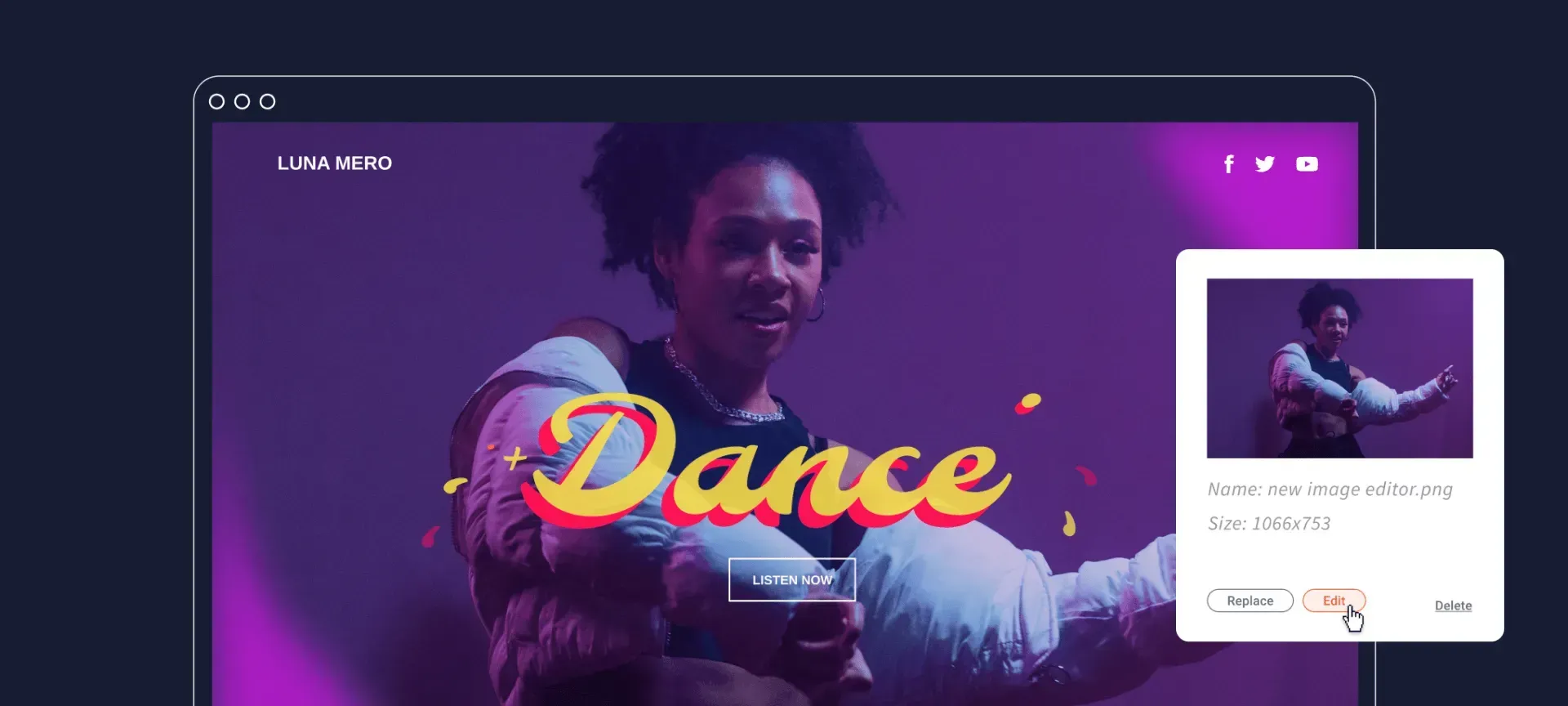
We've said it time and time again... people buy into people. What this means for design is that using people in the images you use on your site can subliminally divert users’ attention. For example, there could be a picture where someone’s gaze is aimed at the big call to action (CTA) button, driving a reader to both see it and possibly click on it. Another reason to add images with people is that it can serve as social proof, which builds trust and credibility.
Another aspect of your site that can leverage human emotion is the colours you use on your site. All the colours have connotations and have the ability to influence a person's emotions. For example, little blue is seen as a calm, relaxing colour whereas red represents danger and urgency. So look into the colour scheme of your site and see what it says to your users. If you want to learn more about how you use colours to evoke emotions, click HERE.
Limit the number of choices
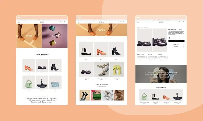
Hick’s Law states that the time it takes to make a decision is directly proportional to the number of choices available. So when you're designing a website, keep Hick’s Law in mind. You should have a clear call to action and a limited number of options available. Keeping it simple has never been so important. Simplicity will ensure that the right people will stay on the page long enough to make a choice to buy.
Keep your web design distraction free
Another point along the lines of simplicity... making sure there's no distractions. There’s a psychological principle called cognitive fluency which indicates that a person favours easier tasks rather than harder ones that require mental processing. So what that means in terms of web design is that minimalism is a powerful tool - the less design distractions on your website, the more likely a user will stay on your site and buy your products.
Create a sense of urgency for the web visitor
This is where the power of the fear of missing out comes to play. The idea that there is only a small window to get what you want or to enjoy something that everyone else is doing is a very tangible and real psychology hack you need to know about. Capturing this sense of urgency can be done a number of different ways. Common examples you've see are:
- For 24 hours only!
- Sale ends 14th July
- Membership Discount This Month Only
- Buy Now For Free Shipping
Conclusion
There's no single formula to creating a successful web design. There are so many tools to help you be creative, but these psychology hacks are specific tools for understanding and leveraging emotions and experiences in a profitable way. Carry out what you've learnt today and win over your prospective customers straight away.


