What is Web Personalisation?
To put simply and without all the unnecessary use of jargon words that prolong the point being made - website personalisation is the practice of building a customised website experience for each visitor that comes to your web page. Rather than displaying a single, one size fits all experience, your personalised website displays a bespoke experience based on your visitor’s characteristics.
The website personalisation process used to be a difficult and time-consuming task. But today, with the right tools and focus, you can ensure the best experience for every web page visitor, literally by a click of a button. The goal is to make sure every visit isn’t generic and boring; your customers want something a little bit different.
4 Benefits of Website Personalisation
Now, let’s explore how you can use website personalisation to boost your online presence, overall sales, and improve your customer’s experience on your website. There are many benefits of website personalisation — but here are just 4 of my favourites:
1. Better Converting Calls to Action
A call-to-action (CTA) is a great way to move things along when selling a product or service(s), but its value extends beyond simply initiating a final conversion. A good CTA can encourage someone to read your blog, start your free trial, take your survey, or watch a run through video you’ve created.
Regardless of what kind of CTA you apply, you are going to want to personalise it. According to HubSpot, personalised CTAs perform 202% better than their generic counterparts. For example, if someone from your emailing list visits your website, you wouldn’t want to show them a pop up asking them to sign up again. You’d be better off encouraging them to take a different action, such as a purchasing a new product that they haven’t seen before or downloading a free guide on something your customers find interesting.
2. Better Understanding of Your Customers
One of my personal favourite benefits of website personalisation is that you can efficiently sort customers into personalised funnels. For instance, CTAs can encourage visitors to tell you key information about them i.e., what industry they work in, the size of their company, their location etc, etc. So, based on what they enter, you can segment your audience to different versions of the website, how cool is that?
Creating better lead qualification systems is fundamental in increasing your website’s conversion rate and that’s what you want.
3. High Converting Landing Pages
There are certain touch points of the user experience, such as landing pages, that are just great opportunities for personalisation. As a business, you should be advertising your products/services online and pay special attention to landing pages, as one that is properly optimised can have a huge impact on your revenue.
If you want to know the ins and outs of having the best converting landing page for your business, download our free PDF. This guide will explain what a landing page is, what benefits of a well structured landing page and how it can influence your business’ performance online. Utilise the power of landing pages and see the impact it makes.
4. Increased Time on your website
It almost goes without saying that when you show someone content that is relevant to them, they stick around for longer. If you want to improve the time your customers stay on your website and decrease bounce rate, you have to personalise the experience. You want to give people a reason to explore your website and view all the products/services you provide. For example, visitors on your website will want each and every experience to be fun so an upcoming event or a release date of a new product is a great way to do this. Showcase what’s new!
How can you personalise your website?
With every Avanty website, website personalisation can be made by a click of a button. Let me take you through just how easy it is to make these personal touches that can make all the difference to your website.
Firstly, head over to the website you are building, and you’ll see on the left-hand side, there is a toolbox with different options.
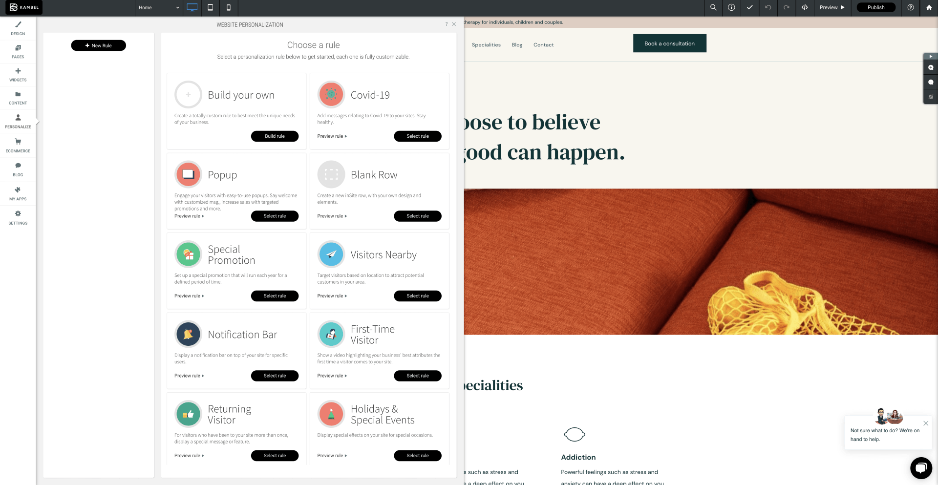
There you will see a button titled “personalize”. Click that button and you’ll see the options seen in the above image. This is where you can add pop ups, special effects for special occasions and apply rules depending on whether the visitor is seeing the website for the first time or they’re a returning visitor, and much more.
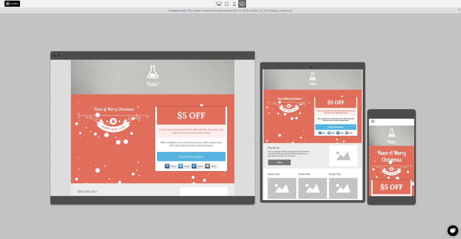
There, you can also preview each and every rule before applying it to your website. All you have to do is click “preview rule” underneath the brief descriptions of each rule. For example, if you wish to add a Christmas gift for those visiting your website during the festive period, you can apply the ‘Christmas is coming’ tool. This is a great way to add a little touch that other websites don’t do. For instance, you can add floating snowflakes or other special occasions such as Valentine’s Day, you can have hearts appearing on the screen etc, etc. Whatever the occasion, you add that little something, something for the visitors to your site. As you can see below, in the preview mode, you will have a visual of what the rule looks like before you’ve edited it (note: every rule is completely customisable to your desire) as well as seeing how it displays across different devices. How awesome is that?
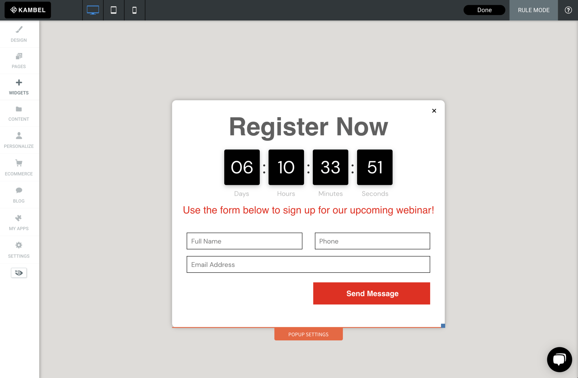
Once you click on the rule you’d like to apply to your website, you will have the option to edit the rule. Just click ‘edit the rule’ to add your own touch to it. As seen in the image, I have personally gone with the Pop-up rule. So I’ve click that rule and have now reached this section where I can choose to be specific with where and how the rule is applied to my website. I can choose which devices will display the rule, the target audience the rule applies to base on their location, set a date and time in which the rule applies to my website, set the number of visits required for this rule or be specific in which URL displays this particular rule. If you wish, you can tick the “display to all visitors (no trigger)” box so no matter the device, location, time/date or number of visits, you can apply this rule to your website.
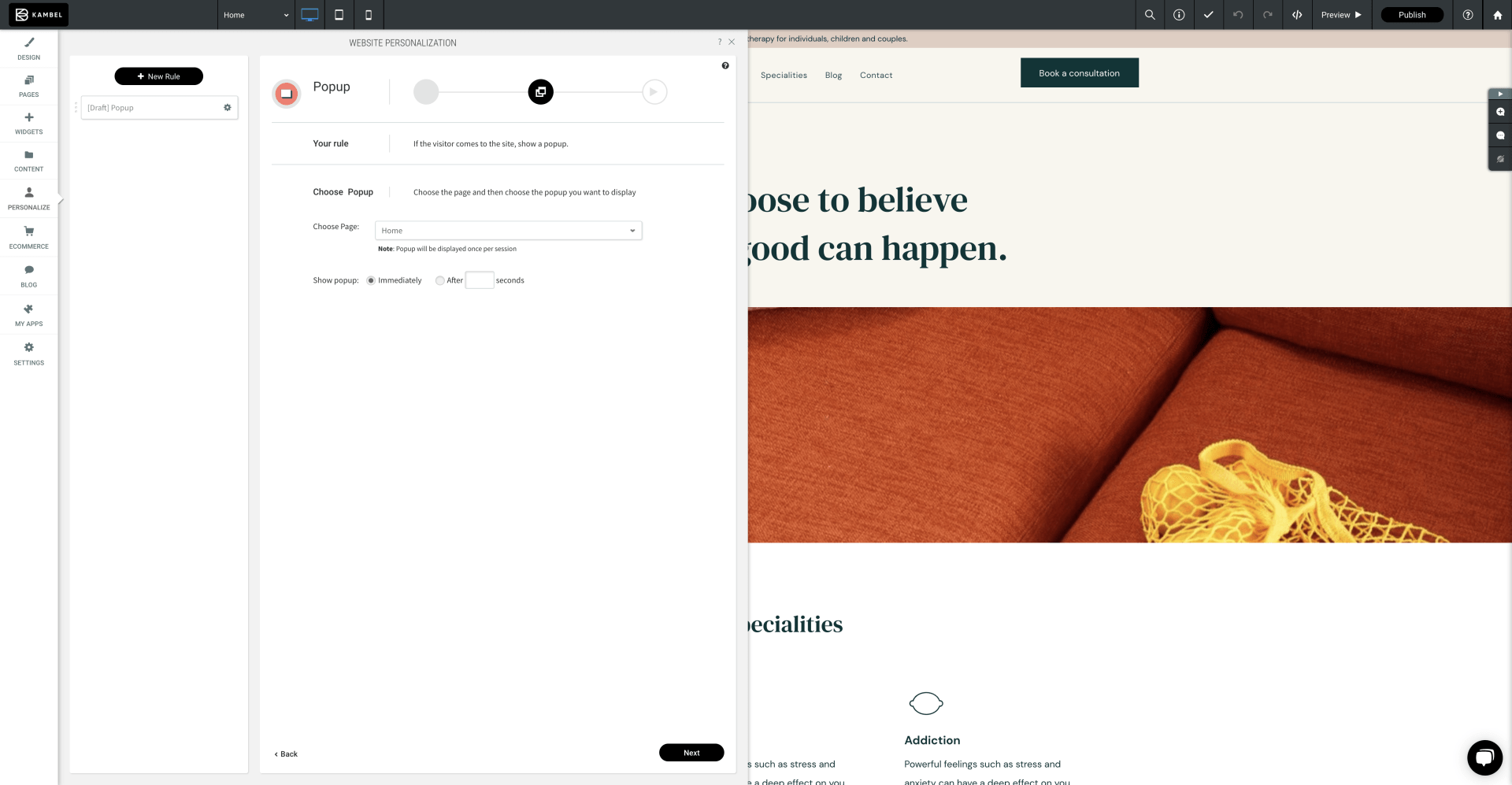
Once you’ve done that, click next and you will be able to choose which page and when the rule is applied. So, carrying on with the Pop-Up rule example I have been using for this blog, you can see in the image above that I can choose any page on my website. I can also pick when the pop up appears, I can choose either immediately or I can specify how many seconds the visitor spends on my website is when the pop up appears for them. Additionally, as you can see on the image above, there is a note message that states the pop up will be displayed once per session, meaning it will only appear once every visit. No need to worry, your audience won’t be bombarded with the pop up appearing every 30 seconds, that would be an absolute nightmare!
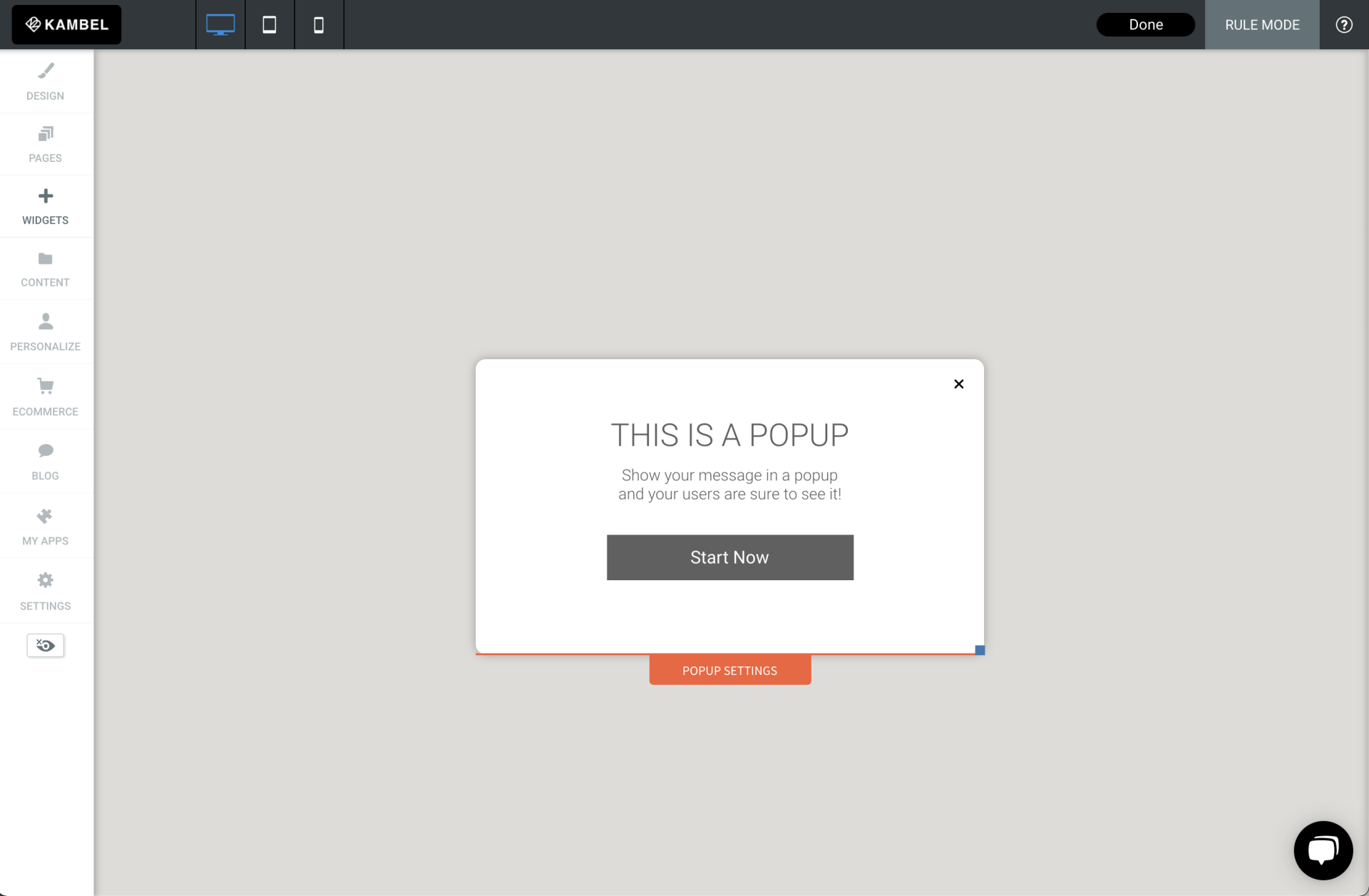
Again, click next and there you are, the rule is applied. Now you can edit the rule to your desire. You can change the sizes, edit the text and amend the overall style of the rule to suit you and your business. In my example with the pop up appearing in my website, I can easily change the message, design and settings of the pop up simply through the Avanty personalisation tools.
If you have any questions about adding website personalisation and how to customise them, our award-winning customer support team are here to help. Schedule a one to one session with us and let’s get your website to the next level.
-
Features
-
Useful Links
-
Reasources
-
Help & Support
-
The Legal Stuff
-
Contact Us
RESOURCES
CONTACT US
Gateway House, Grove Park
Leicester, LE19 1SY

