One aspect that is often pushed aside in the process of maintaining a strong online presence for your business is paying close attention to the website visitors and understanding what drives them to the website, or more importantly what keeps them there.
This is where Psychology can come in and be your best friend when it comes to attracting the right audience to your website and encouraging them to journey through. But what is Psychology?
Psychology constantly produces amazing insights into how the human brain works and the understanding of human behaviour, so we can take this knowledge and apply it to every website, no matter what the website covers. You can strengthen your website's appeal to your target audience, improve the website's overall performance and see an increase in click rates and sales. Exactly the outcome you as a business owner wants!
So, now is the time to ask yourself: Is your website achieving the level of sales you want?
If the answer is no, here are 9 psychological tricks that can guarantee a boost in your website’s sales.
Offer free shipping (where possible)
Those visiting your website get anchored to the initial price they see, when it comes to a service or product they want. This means if you want to charge an additional fee for shipping, you should include that cost in the initial price. Why? Well, when buyers find out about additional costs later on, it creates anxiety that causes many to shun away from completing the intended purchase. Just think about your own online shopping experience, you find something you love in your favourite online store but then they add on a £4 shipping charge when you are ready to purchase and you’ve abandoned the cart, right? We’ve all done it! So, take into consideration that additional costs may be causing no purchases.
Note: when you explain that shipping is free, on the other hand, your customers will trust your brand and feel you're doing them a favour of sorts. So where possible, add the words ‘FREE SHIPPING’ near the price of your products and watch the sales go up.
Price your products with odd numbers (for example 95 or 99 at the end)
This is known as the left-digit effect. When a customer sees a price of £19.99 instead of £20.00, it makes a big psychological difference. Instinctively, your customer becomes anchored to the 19 number instead of the 20. Plus, the customer places it in the 10-20 range as opposed to 20-30. Despite it being literally a penny difference, your customers will perceive your product as more affordable if you use this small psychology trick to boost your website’s sales.
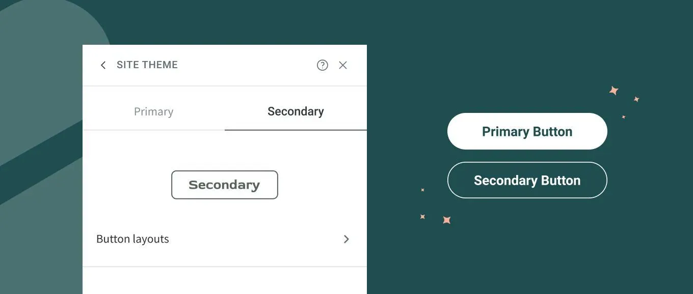
Call To Action (CTA) buttons on the righthand side of your web pages
Think about it, we read from left to right, so psychologically we associate the left with the past, and the right with the future. So, we advise you position your CTA buttons such as ‘BUY NOW’ on the right-hand side of the page so they see it as part of their destination. Your website is the journey and the buy now button is the destination.
Offer product/service upgrades at the checkout
Towards the end of the checkout process, offer product or service upgrades.
This is called upselling and most businesses execute this trick to improve website sales. Your customer might be committed to already purchasing something for £120, let's say. Throughout the decision-making and checkout processes, they'll be convincing themselves it's a good purchase. So, if you offer a £10 addition (for example a warranty) to ensure the product at the end, for example, they'll be more likely to buy it. Your customer will think, "What's a difference of £10?" because they have already psychologically adjusted to that initial price.
Create a sense of urgency for the customer
Your customers are much more likely to pull the trigger when they think there's finite time to do so. When they believe they can buy the same product tomorrow or a week from now for the same (or even a lower) price, they're less likely to make the purchase today. So, creating a sense of urgency leads to faster sales being made through your website. This could mean showing a limited number of items left in store or having a sale for a period of time. Add to your website that the current prices won't stay the same for long, so it’s engages a “now or never” response for your customer.
These signals will push the visitor to your website into a quicker decision. It will also make them think they are “getting a steal” for either a discounted product/services or insinuate that many others have already made this purchase so it’s worth having.
Tell your story on your website
People like getting behind a meaningful story, to be nosey more than anything. Your website can effectively share your story if you want to. Through text, video or other mediums, you can demonstrate who you and your business are. There's a reason you started your business and a problem you are trying to solve, and your audience want to know the details.
Making your story and the problem you solve clear to those visiting your website will help them see the people and the passion behind the business and website. Plus, a customer who believes in your story is certainly more likely to buy your products/ service to support your mission.
Shout from the rooftops about your partnerships
If you work with any well-respected and well-known partners, display their logos on your website. For instance, if you use highly trusted payment portals (such as PayPal, Stripe, Google Pay etc) that everyone loves and respects, display their logos. This is a great way to build your credibility and trust for your target audience.
Use the middle effect
When buying something, most of us are looking for the ‘just right’ option – not too cheap, not too expensive. To help your customers spot this option, place the ideal purchase in the middle. When you include three similar products, as opposed to two, customers are likely to spend more. When there's only a cheaper option alongside a more expensive option, on average the cheaper one will be selected. Adding a third option, however, makes customers more likely to buy the middle one (which would have been the pricier option in the two-choice scenario). This is commonly known as the Goldilocks effect.
These methods are proven to work, but each case and scenario is different. It is a test and measure situation for every website that offer products and/or services. You should continue to make subtle changes to see which versions work most effectively in order to reach your maximum sales per month, per year.
Demonstrate credibility
Adding customer testimonials or statistics indicating frequent use of your product will boost your sales massively. For example, adding reviews to every product you offer your customers or add statistics such as how many people have bought/used your company in the last 12 months. This is especially effective when you include that piece of information near the "Buy Now" button. This lets the visitor to the website, who is interested in what you have to offer, know they’re not alone and that your brand is respected. This will give the customer more faith in the purchase of your product/service.


