When it comes to website design, there are so many different directions in which your website can go: it can be anywhere from elegant and minimalistic, to bold and vibrant to sleek and modern.
While the final look-and-feel should exude your line of work and brand identity, there are a few ground rules that are always applicable, no matter what.
To frequently attract new leads and nurture loyal customers, you need a well-designed website that entices and engages them. Great web design naturally feeds into your user experience (UX) and functionality, while being easy to understand at first glance.
It’s no secret, that a poorly designed website will drive leads away. Your target audience and potential customers will seek out another company, causing you to lose business to your competitors.
That’s why below we’ve gathered the top essential website design tips to help make your site active, compelling and stand out from the crowd:
1) Keep your homepage minimalistic
The homepage of your website should communicate your core message promptly. After all, we very rarely read every word on a website (… I sure don’t). Instead, we quickly scan the page, picking out keywords, sentences and images we’re looking for. TIP: With these known behaviours in mind, it’s better to appeal to emotions rather than word count.
The less the user has to read, click on, or remember, the better! They’ll be able to process and evaluate the content and make a decision early on if the website contains the information, products or service they’re looking for at that moment. So, design for decreasing attention spans, as users are more likely to do what you intend them to do.
See below our top tips that help you break up your content and make for a presentable and inviting homepage for your potential and paying customers:
- Keep important content above the fold: Every visitor should understand what your website is all about straight away, without having to scroll or click anywhere.
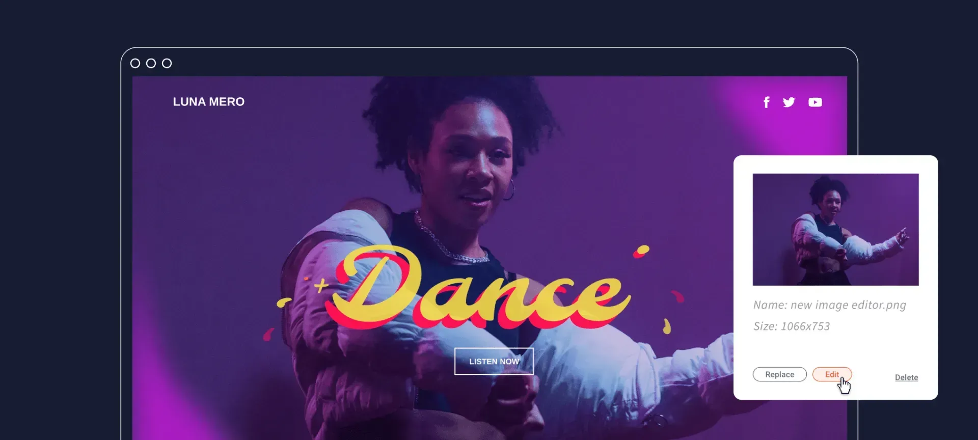
- Add imagery: High-quality media features such as beautiful photographs, vector art or icons, will do wonders as alternative ways to communicate your point.
- Include a call-to-action: From purchasing to signing up, encourage site visitors to perform the action you intended by placing a call-to-action (CTA) button on your site’s homepage.
- Space out your content: Employ whitespace in between elements. By leaving some areas blank, you’ll give the design a much more spacious, well-balanced feel. As for your text, write in bite-sized, legible paragraphs.
2) Utilise a visual hierarchy design
Hierarchy is, without a doubt, an important principle of web design. Why? Because it helps display content clearly and effectively. Through the correct use of hierarchy, you’ll be able to lead site visitors’ attention to certain page elements in order of priority, starting with the most significant/ important piece.
Find below are the main components of the visual hierarchy:
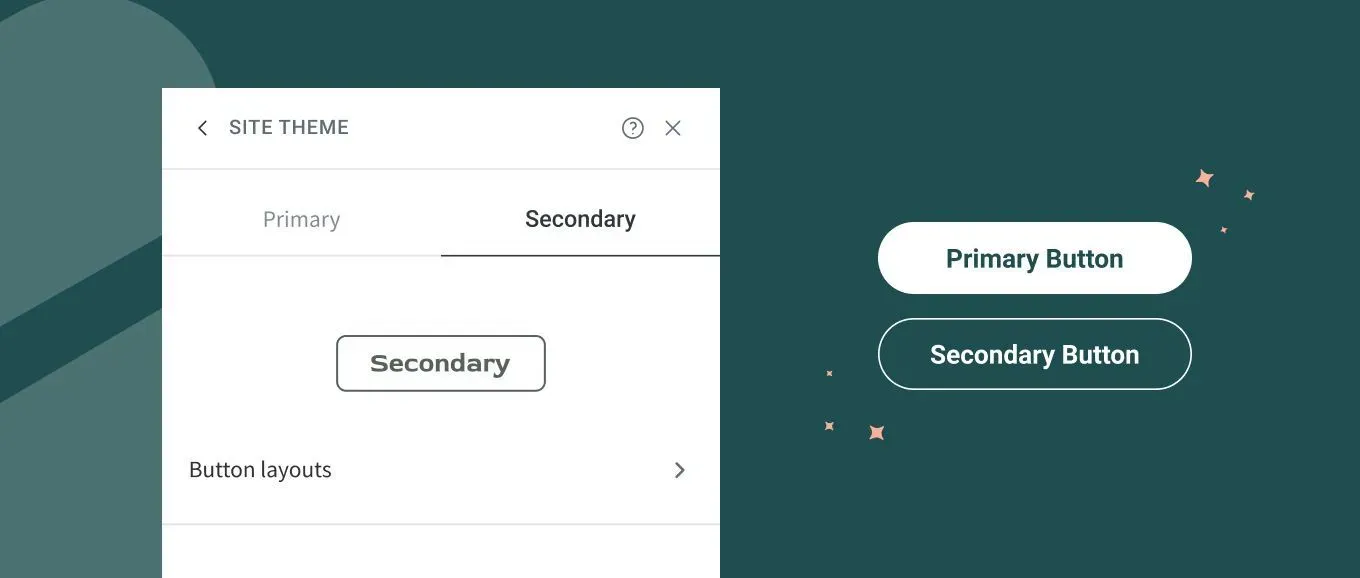
- Size and weight: Highlight your top assets, such as your business name and logo, by making them larger and more visually prominent on the page. Readers naturally gravitate towards large and bold titles first and only then move on to smaller paragraph text.
- Element placement: Use the right website layout to steer your visitors’ eyes in the right direction. For instance, you can place an important call-to-action button at the very centre of the screen or position your logo at the header.
Once you establish a clear hierarchy, the user can’t help but unconsciously follow the breadcrumbs you have left for them. Then, apply colour, contrast, and spacing for further accentuation, of course remaining mindful of what draws the most attention and making sure that it’s always intentional.
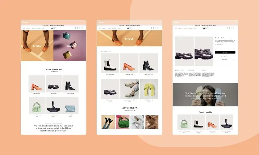
For more ideas and inspiration when it comes to powerful web design, check out our designer-made website templates.
3) Create easy-to-read website content
Readability is incredibly important when designing a website. It measures how easy it is for people to recognise words, sentences, and phrases, and when your site’s readability is high, users will be able to effortlessly scan (skim-read) through it. This way, taking in the information becomes effortless – exactly what the reader wants/needs.
To successfully achieve website readability, try these rules:
- Contrast is key: Sufficient contrast between your text colour and the background colour is important for readability, as well as for website accessibility. While your website colour scheme is likely to be representative of your brand colours, make sure that there’s sufficient contrast between your elements. To do so, try using an online tool, such as Contrast Checker. NOTE: black text on a white background is a form of contrast.
- Use large letter size: Most people will struggle to see smaller fonts. A typical rule of thumb for web design is to keep the body text at least 16pt. That’s a good place to start, but keep in mind that this number completely depends on the fonts you choose for your website.
- The type of fonts: The world of typography offers many types of fonts at our disposal, sometimes it can be overwhelming the amount of choice you have. You can choose between serif fonts (that have little projecting lines on the ends of letters, like Times New Roman) to sans serifs, which means “without serif.”
Sans serif fonts are typically the best choice for lengthy online texts. You can also create interesting font pairings by mixing these different types together.
Many display fonts are more on the decorative side, such as script fonts that look handwritten. If you’re going for one of those, make sure not to overuse it, to avoid an overwhelming effect. - Limit the number of fonts: Don’t use more than three different typefaces throughout a single website. Some projects may call for more elaborate font combinations, but too many varied fonts usually appear cluttered and distracting, quite damaging to your overall brand identity.
- Utilise text themes: To help establish a clear hierarchy, make sure that your written website content is varied in size and weight - from a large title (H1 titles) to smaller subheadings, to the even smaller paragraph or body text. This can ensure that there’s always something to draw the users’ attention.
4) Make your site easy to navigate
You want the web visitor to easily find what they’re looking for, right? Well, make sure your site is easy to navigate. A site with solid navigation helps search engines index your content while greatly improving the user experience too. Here are some ways you can ensure your website is easy to navigate:
- Link your logo to the homepage: This is a common practice that your web visitors will be expecting, saving them some precious time and clicks. If you don’t already have one, it’s highly recommended to create your own logo as part of your branding efforts.
- Have a menu: Whether opting for a classical horizontal list, hamburger menu, or anything else, your website menu should be prominent and easy to find. In addition, be sure that it’s structured according to the importance of each section (hierarchy again).
- Offer vertical navigation: If your site is long-scrolling, like a one-page website, use an anchor menu. With one click, the user will be able to quickly jump to the section of the site they need. Another option to consider is the ‘Back to Top’ button, which leads visitors to the top of the page wherever they are on your website.
- Have a good footer: Your website footer is probably the last thing to be seen on your site, and it’s a good idea to place all of your important links there. This often includes your contact information, social media icons and a shortened version of your menu, or any other relevant links that the user may need.
5) Ensure your site is mobile-friendly
All of the visitors coming to your website should be able to enjoy your site at its very best, no matter the device they’re browsing on. NOTE: When designing a website on the Avanty web builder, it automatically creates a mobile-friendly version of your website. Perfect to help you keep up with the increasingly mobile world.
Go over your site’s mobile version while putting yourself in the position of the user, and test out every page, button and user action.
NOTE: Your mobile website should be cleaner and less cluttered than your desktop version, so it is an idea to minimise page elements and scale down some assets, like the menu.