Bespoke websites are composed of different parts that seamlessly fit together to create a holistic representation of your business and what you have to offer. That's a fancy way to say all parts of a website must work together to get your message across to your audience, in a way that encourages them to become a paying customer. And in order to help you understand the various parts of a website, we’re going to break them down and elaborate on what they do and why they are important.
This blog will cover the main components of websites as well as some important web design jargon to help you get through the website design process. If you’re looking to cut to the chase and create a website with a tool that will ensure that all website parts are accounted for, we suggest using the Kambel web builder.
Must Have Elements to Every Website
There are some components of websites that are so essential to web design that all sites must contain them in order to function properly. Together these parts form the backbone of your website:
1) Header & Menu
The header is the uppermost part of a website, that often is the first thing that visitors see when they enter a website. The header almost always contains the brand’s logo as well as the website menu. This website menu acts as the map of the website, to help visitors find what they’re looking for - whether it’s details about your products, information about your company or how to contact you.
Typically, the headers of a website include the most important pages, of which may vary depending on the type of website you’re creating. If you have an online store, for instance, you might divide your header into categories based on the different products that you sell. On the other hand, if you have a nonprofit website, a donation page in the header would likely be more appropriate for the aim of the website. It's incredibly important to include the proper categories in the header to help visitors find the most important pages of your website. And well, the header and menu can make all the difference between a successful and an unsuccessful website.
2) Images & Videos
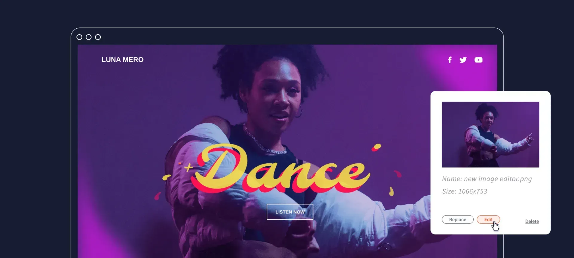
Immediately below the header is some form of imagery, whether that be photos, artwork or sometimes a video. Together, the header and main image comprise the top section of a website - often referred to as above the fold - and are essential in creating a good first impression. The visual at the very top of your website, in particular, makes a marked difference in whether visitors stay on and journey through your website or abandon within seconds after entering.
With that in mind, this visual should convey something important about your company and what you have to offer. Whether it features images of your products and/or services, or just gives the user a feel of what your brand is all about, it's important that it relates to your website as a whole.
3) Written Content
All websites contain content. Content typically means written words that explain what your website is about, what your business has to offer and how the visitors can take advantage of your products and/or services.
Website content covers a wide array of things. It often refers to the paragraphs that explain your website’s aim, but it can also mean the one word that is placed on the buttons in the menu bar or even the call to action buttons found within the website.
While short content on buttons or menus may seem insignificant, it's actually the driving force of websites. This is the content that makes it clear what the visitors should expect when they click through your website, such as “Buy Now” or “Book Here”. Take the time to carefully plan out your website content to ensure that every visitor can understand what to do, as well as you do.
4) Footer
A footer is the bottom part of any website, that usually contains a sitemap with links to the pages available on the website. The footer can help visitors find all of what your business and website has to offer, including those that may not have made the cut to the top of the page, in the header.
Often website footers also contain basic contact information about your website and a social bar that contains small but recognisable icons that lead visitors to your social media pages. These can help you gain followers on social media platforms, ultimately bringing about greater brand awareness, overall website success and potential business growth.
Additional Elements To Add To Any Website
If you were to just include the website parts mentioned above, you’d have a structurally sound site. However, you will want to add more than just those mention above to truly attract your customers to visit your website and journey through to the checkout. We suggest adding the following parts as well:
1) Logo
A logo represents the company and makes it recognisable and memorable to both current and potential customers. Typically, the logo of a company can be found in the top left hand corner of the website header and is usually clickable, to help visitors return to the website’s homepage.
2) Call To Action (CTA)
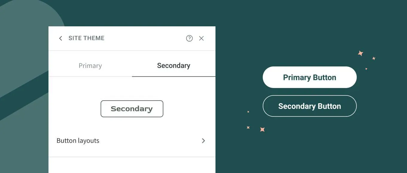
A CTA is a short piece of text on a button that helps customers take the next step through your website and move down your sales funnel. The text found on these buttons contain actionable words like “Start Today” or “Buy Now”. These buttons direct users to take a specific action and tells them exactly what to expect when they click on the button. Without these buttons, you could see fewer sales and a higher rate of customers leaving your website without converting.
If you are interested in learning more about CTAs and how you can implement them to your website, click here for our top tips to creating the best ones and see the sales roll in.
3) Blog
Blogs are groupings of articles or posts on a variety of topics that are relevant to your business. It’s increasingly common for businesses to add a blog to their website as additional content for their audience. Blogs provide more in-depth information to your customers about your offerings or industry whilst also ensuring you are nurturing your customers and helping them understand what your business and what you can do for them..
A blog can also help bring more traffic to your website. By covering a variety of topics found within your industry, in depth, blogs can provide the answers to many questions that people search for on Google. When you answer these questions, you help attract people who may not have found your business otherwise.
4) Forms
Online forms are generally used to make contacting you easy whilst also gaining information about your clients. For example, it is good practice to add a contact form to a 'Contact Us' page on your website as it enables visitors to contact you directly from your website, whilst also giving you details such as name, email, reason for contact etc.
The Layout of These Elements
Now that you’ve determined which parts of a website you’ll need when building your bespoke site, you might be wondering how to structure them. Yes, there are many different website layouts, each of which has its own benefits and keeps your website orderly.
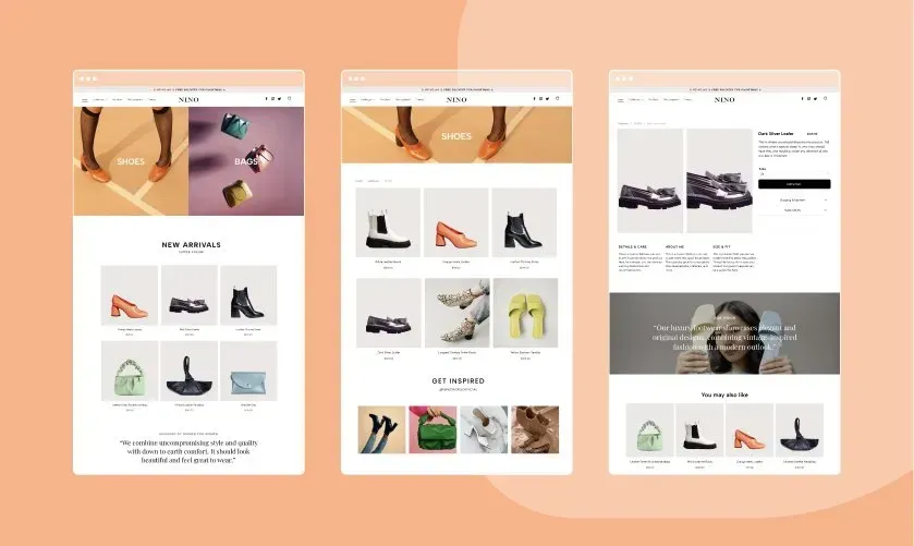
The "classic" website layout contains a homepage and multiple web pages that enable your customer to find the information they’re looking for, through a journey. Another option is a one-page website design where you place all the information on one long, scrolling page. The advantage of this layout is that everything that a visitor might be looking for can be found in just one place.
Think about the layout that works for you, in a way that can get all the information out to your customers in an effective way. If you're unsure as to the layout that will work for you, look at the Avanty templates for inspiration or simply use the template that stick out to you.


