Our latest product update ensures your website will look great on multiple screen sizes, including iPad, with the new responsive layout for desktop/tablet. This enables you to control site layout according to breakpoint (1024 px) rather than device. Plus this update is already enabled in new sites, and can be toggled on in existing sites. Learn more about this update below.
Easy control over your site layout
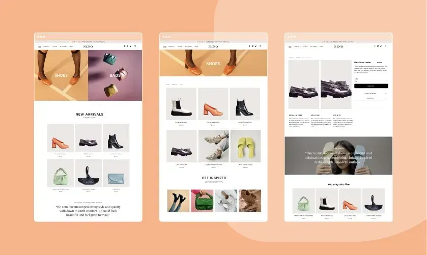
Responsive layout means your website will look great on multiple screen sizes, ensuring a better experience for your audience. This means, for example, that a top navigation header on larger desktops automatically switches to a hamburger menu when the screen size is below 1024px. How cool is that!?
Already enabled in all new sites
This new capability is already enabled in all new websites built in the Avanty platform. And for existing websites, you can toggle it on via Global Design > Page Layout. This can be done at any time and your website will go back to the previous tablet view. Mobile view is not affected, and remains determined by device.


