Let's begin this blog by having a quick recap on what the term User Experience (UX) actually means. "UX is a user’s ability to navigate your website and considers the thoughts, feelings and emotions they have during the experience". By designing your website strategically, the ultimate goal is to develop/ improve a product so that it provides the best possible experience for your customers, from start to finish. After all, your website has become the most powerful tool than ever before. Your website is a 24/7 salesman, and as such, it has the potential to be the most powerful asset of your marketing efforts. So what can you do to drastically improve your website's user experience? Here are just 5 tips you need to take on board and apply now!
Use white space
White space (or negative space) is essential to good design! White space can make your content more legible while also enabling the user to focus on the key elements surrounding the text on your site. According to Crazy Egg, white space around text increases user attention by 20% - that's an amazing percentage that cannot be ignored.
White space can also make your website feel fresh and modern without it being too busy. However, one downside of white space to keep in mind is that it does indeed take up space. So this is where you need to be clever with the design of your site - make room for white space and reap the benefits. If you're trying to get a lot of content above the fold (the first section of your homepage before you start scrolling) having too much white space might be replacing some valuable information your audience need to know. So it's important to find the balance between what is most important to communicate at the top and surround that with some space to subtly highlight it.
Optimise your page speed
It is one of the most frustrating experiences for users of the web is waiting a long time for a page to load. With the rise of the mobile devices, people are accessing content all over the world on many different platforms. While browsing online, we all expect a fast result for the content we want to see. Slow loading = higher bounce rate (level of people leaving your site). In fact, research conducted by Google showed that the bounce rate increased by 32% when a page load time went from one to three seconds, and by 90% when the page load time went from one to five seconds. If a website takes as long as 10 seconds to load, then the bounce rate increases to an astonishing 123%.
Get your page speed score through Google - they offer free service where you can get the information on your page speed. Google will also offer you some suggestions for improving your load time on different screen sizes. A resource you should definitely be using right now.
To improve page speed, start by compressing the images you want on your site before they appear on your website. Image file size is one of the leading causes of a slow page speed. To compress the images you use properly, we recommend you use a site like Compressor as they can help you speed up each webpage on your website.
Use images
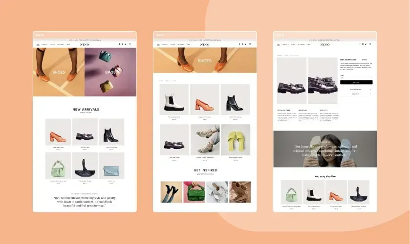
As we've slightly covered the subject of images, now is a great time to dive into it a bit more. How can you use the images on your site wisely?
We, as web users, are getting smarter and faster at judging business websites before deciding if we want to browse the website any further. When we first visit a site, we can easily pick out a generic stock photo we've seen somewhere else or something that resembles the non-personal style of stock imagery. Using stock photography can decrease trust and stands out as being non-unique. Unfortunately, these associations carry over to your business as well. So you'll be seen as untrustworthy and unoriginal.
Ultimately, no stock images would be capable of conveying your brand, products and services the way you want to. Only your own actual images can do that. Use your own high quality images strategically and place them in your website to support the content and allow the users a visual break from text, but make sure they are relevant to what's being covered on that page.
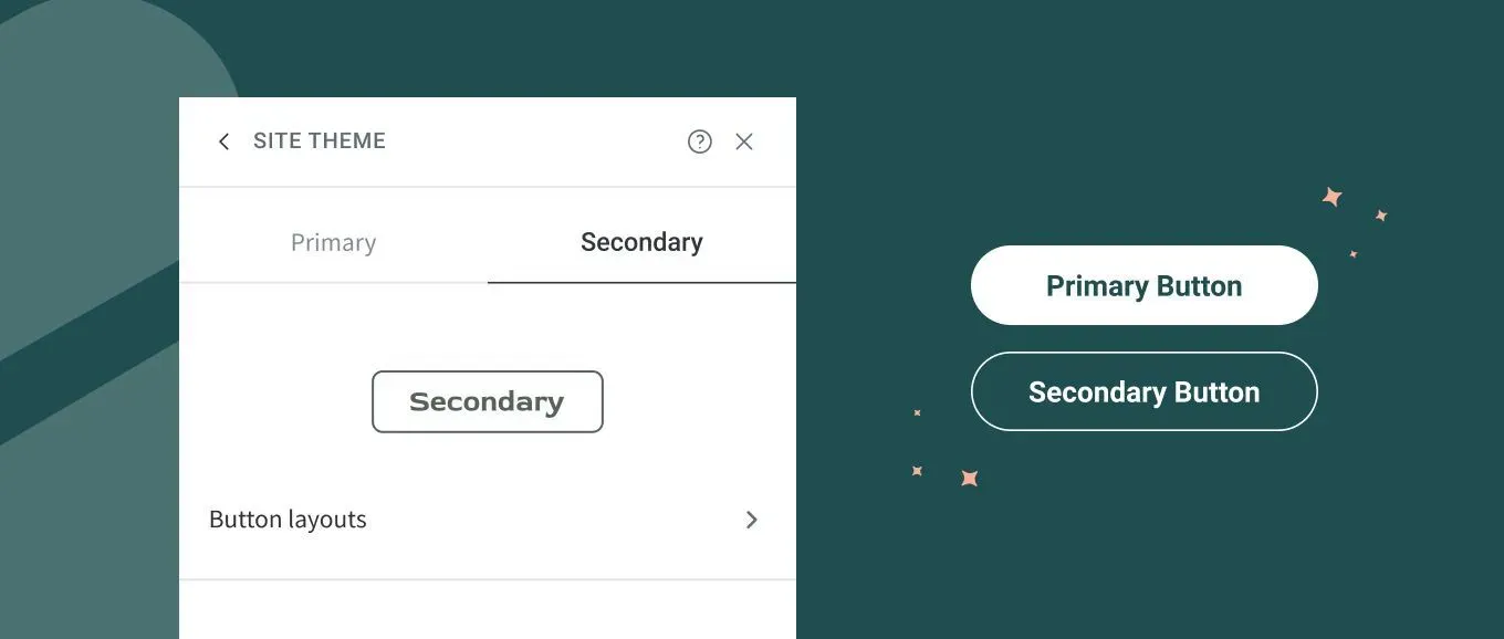
Use eye-catching call to actions
Your customers are already accustomed to following visual cues to determine which content is important to them. Call to actions (CTAs) that are clearly marked with an action word enable your audience to easily navigate your website and get exactly what they want in the location they expect to find it.
The first thing to consider when creating buttons for your website is the way it looks and the colour use. Make sure the size and size is eye catching, but no overwhelming to the point it takes too much focus away from the relevant text on the page. And when it comes to choose the right colours, that's where the psychology of colour comes in to play. Think about the message that you want to evoke for a user (trust, intelligence, loyalty) and choose your colours wisely. We have a great blog covering the psychology of colour, click HERE to give it a read.
The second thing to consider is the actual words you use in the buttons. The words should include an action word that excites your audience to do something. Choosing the right words is highly determined by the level of emotional identification that word prompts in the person reading it. No emotional connection = no action (the exact opposite to what you want). So make the words you use are bold and action-oriented. Our favourites include: Sign Up Today, Get Started, Learn More, Contact Us and Book Now.
Be responsive & mobile-friendly
It's imperative that your site is mobile-friendly and easy to navigate no matter what type of device they use to access it. For some time now, Google penalises websites that aren't optimised for mobile devices, making the need for responsiveness even more crucial for your online success. This is, without a doubt, the most valuable way in which you can improve your website's usability. If you're not sure whether your website is mobile friendly or in fact responsive to all screen sizes, use this free tool NOW.