Everyone’s talking about heading tags, H1’s H2’s building pages for humans not bots, so let’s take a deep dive into what headers mean on pages and the importance of how search engines and viewers see them.
Let me first make it clear H1’s is important even though search has changed and the way google sees a web page has changed they still play an important role when building a webpage.
But it isn’t just making sure we use H1s on webpages or even how we use them.
It’s actually understanding what an H1 is (in modern definition) and how it fits into a page’s organisation, when displaying your content for a user to digest.
Note in Google Panda update the introduced a learning algorithm that looks at how a page has been created and how well it has been structured, a recent article at Moz will better explain what Google Panda is and how you can better structure a web page to recover from Panda updates.
More importantly, it’s knowing how an H1 – and other header tags (H2, H3, H4, etc.) – fit into the overall user experience of that page and the website as a whole.
Technically, your main header tag doesn’t even have to be an H1.
But whether it is an H1 or another header tag, that main header is incredibly significant still to the overall users experience and search, because this still indicates to a user what content they should expect to find on the page that they have just landed on.
Let me explain.
H1s Aren’t What They Used to Be
H1s used to be systematic and standardised but this is no longer the case, as search engines are getting smarter and focusing more on user experience than heading structures and keyword density.
The idea of using an H1 as a main category – a headline, has not changed.
But the role of that header is built more around the overall user experience of the page – and how it helps to improve that experience – than the keyword variations included in it and the order in which an H1 shows up in the header hierarchy.
So, that main headline doesn’t have to be an H1, but the fundamentals behind it acting as an H1 remain the same, therefore it is important to remember that you should only use one large title that describes to your user what they are going to read while on the page that they have just arrived on as this will give them a clear indication that they have landed on the correct page.
Then the rest of the page’s content should comfortably exist below it on the page, likely in the form of sub headers and well organised under these headers making the readers experience much more inviting and easier to digest your content, remember build pages for humans do not search bots, this has been a clear shift from Google over recent years in a bit to eliminate websites that have been stuffed with keywords and hidden useless content that as reader cannot see.
To further understand the importance of an H1 – and how to craft perfect ones for your content – it helps to understand where H1s came from and how they evolved.
Because now, their purpose is important, but their formality is unrestricted with rules or prerequisites.
What H1s Used to Be
There used to be some pretty straightforward requirements for H1s in regard to SEO.
- Include the most important keyword(s).
- Don’t use more (or less) than one H1 per page.
- Make sure the H1 is the first and largest text on a page.
However, Google has made it clear these are no longer the rules of the land.
Websites have evolved, as has the way they are presented, the way they are crawled (by search engines), and the way they are consumed (by humans) hence the term now used by google and SEO experts is that you should build web pages for humans not bots.
What H1s Are Now
Having multiple H1s isn’t an issue, although to make better use of your page structure still good practice as you should still only have one heading for a page so that it is better digested by the user, and so that when bots do crawl your pages they will find pages that are relatable to the content that you are talking about, therefor making it easier for search engine to index your websites pages, but search indexing should not be your overall focus, instead focus on user experience, and google will favour this.
It’s actually a fairly common trend on the web, especially with HTML5, according to Google’s John Mueller in the video linked above. And how many H1s there are or where they line up on the page shouldn’t be overthought if the heading structure of a certain page is the best, most organised way to present the content on that page.
“Your site is going to rank perfectly with no H1 tags or with five H1 tags,” Mueller said in late 2019, but again I cannot stress enough there still needs to be a heading for your page, imagine if you landed on a webpage yourself and it just started with a big lump on text? This would not be inviting for your reader to digest your content.
So, we should always favour the user experience over keyword density or even the hierarchy of headers.
Since some CMSs including our own Avanty builder use styling that may make other headers more prominent than the H1 for whatever design reason.
And, since having multiple H1s doesn’t negatively affect a page’s organic visibility, nor does an H1’s lack of high-value keywords (if it makes the most sense and still summarises the content on the page), crafting headers on a page should be done without too much focus on those elements being an H1 over an H2 or vice versa.
It’s just about making sure the content is organised in a practical and sensible manner.
Mueller cited three ways Google’s system works to understand page headers and how they support a page.
They include a page with:
- One H1 heading.
- Multiple H1 headings.
- Styled pieces of text (without semantic HTML).
This obviously illustrates a lot of freedom when it comes to page style and organisation, as well as header tags in general.
And plenty of sites are being rewarded that use all three of the above-mentioned layouts.
Header tags, including H1s, are also useful for accessibility.
Especially for visually impaired site visitors that don’t have the ability to actually look at the website and its design.
Software that aids users with disabilities to consume websites will read headers in the order it sees them. Thus, H1s are a large part of a website communicating with those users, but multiple H1s won’t affect that page’s effectiveness, even for the visually impaired.
Remember, it’s about the user experience, and I can’t say it enough, build sites for humans not bots.
10 times out of 10, having that semantic structure that indicates a clear organisation of the content on the page is going to work in your webpage’s favour in terms of crawlability, digestibility, and ultimately user experience when reading your content.
Getting the Most from H1s & Header Tags
While it’s been said that H1s don’t directly affect organic rankings (i.e., keyword inclusion, multiple tags, etc.), it’d be impossible not to consider them to be a significant part of each webpage’s overall optimisation and, therefore, presentation.
If headers can help people understand the content on the page in an easier way, it’s likely they can help search engines in a similar manner.
And they do.
Something to also consider when structuring your website in an overall manner and keeping it consistent is that using and setting up your global design aspects and making proper use of your H1 through H6 headings will ultimately aid you in better design and more consistency when crafting your website that doesn’t confuse readers as they go through your pages, the only time I would often advise changing the styling of a page structure is when the entire subject changes, an example of this could be that you have a membership area on your website and you want to clearly indicate that this is different, or you may have a VIP service and want to style it differently, but it has an always will be good practice to only use 1-3 header styles as a maximum on any given website, and ensure that you make good consideration to your styling choices and fonts that work well together.
Consider your main header, which may very well be an H1, to be an accurate summary of the page and its content.
All other topics and categories on that page would likely line up below that main header as a subhead, typically going more in-depth about a topic within that main header.
Think of the semantic structure of a page in a simple way:
- Main header (could be an H1).
- Subhead 1 (could be an H2).
- Subhead 2 (could be another H2).
- Secondary subhead 1 (could be an H3).
- Secondary subhead 2 (could be an H3).
- Subhead 3 (could be another H2).
- Secondary subhead 1 (could be an H3).
- Secondary subhead 2 (could be an H3).
- Secondary subhead 3 (could be an H3).
- Subhead 4 (could be another H2).
- Subhead 5 (could be another H2).
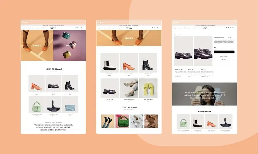
Some of your pages won’t have many or any subheads and others will have multiple this just depends on the content that you are presenting to your user, and another great note to make at this stage is don’t just think about your heading structure but also consider your overall page layout as ensuring a good use of imagery and negative space on your web pages is now just as important as your overall content, as search engine are looking for an entire user experience and not just text/content on a page.
Again, it’s about the content and the best way to present it to the audience, think about how you feel when you land on a web page that is just text, text and more text, it becomes difficult to digest that content and scan for what it relevant to us, these same struggles you will experience are the same if it’s your own content and its displayed in the same manner, and just because you understand where things are and should be this does not mean that a user viewing your content will know the same, so always consider how you feel when you land on a page that is difficult to digest.
Headers Are More Important Than H1s
So, to summarise:
The main heading of a page can be an H1, but it doesn’t have to be, however should clearly explain to the reader what they are about to read on the page that they have landed on and will likely contain keywords relevant to the subject.
Make proper use of sub heading to break up your content so readers can easily scan your web pages and find the content that is relevant to them.
It’s not for a page’s SEO; it’s for the website visitor and the experience they have on the website, create content for humans not bots.
Make good use of your page structure so that your content can be easily consumed by your readers.
Use images to explain text, and good negative space to make your content more digestible to the viewer so that you avoid overcrowding your web pages.
It’s not about SEO.
It’s about users.
And remember to make your message clear and each page layout simple, and easy for your viewers to digest your content, the better you structure your page and display your content, the more your users will engage with your content and are likely to consume it.


