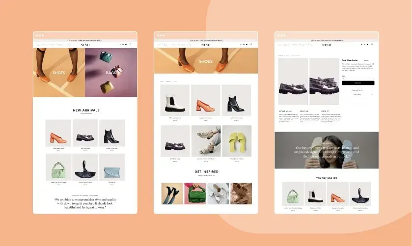
First let me very quickly explain the difference between a home page, a one page website and a landing page.
What is a landing page?
Landing pages: These only have 1 area of your business that they cover and 1 primary call to action, directing the viewer to take one specific call to action. If you want to know the ins and outs of having the best converting landing page for your business, download our free PDF. This guide will explain what a landing page is, what the benefits are of a well structured landing page and how it can influence your business’ performance online.
What is a one page website?
One page websites: These are different to a home page as a one page website is your entire business on 1 page, and let’s be honest don’t often contain enough information for that 1 page to rank because you're trying to do too many different things on that 1 page. However, they are often a great place to start a website and build onto it as you grow.
What is a homepage?
And then there is your home page. Now my definition of a home page may differ from someone else’s however I do believe that your home page should be one central place that prospects can initially land on, that will give them a good understanding and a snapshot view as to what your business does and provides links to more detailed areas of the site.
Now we have that out of the way, let’s move onto what the perfect home page looks like. Well, you’ll be pleased to know that there is no right or wrong way to build a home page, however, there is what we would refer to as industry standard as to what should be included on your home page. And during this article, we will walk you through what should be included and how it should be presented so that you can get started on building your first home page.
What product/services do you offer?
The first thing to consider when building your home page is, what kind of business are you?
Do you offer services? Products? Consultations?
These are all considerations when creating not only your home page but also your entire website, then we need to consider how people will interact with you? Are you going to accept online bookings? Will people be able to book into a class? Or can they buy a product? Be it physical or digital download as again these are all considerations, largely because not only will you need to think about how your home page is going to be displayed but you will also need to consider other software you may need to use to be able to achieve these tasks from your website. In the web world, we call this your flow.
Now for this article, I’m going to keep it simple so we're going to pretend that we are a fitness studio that is offering group classes over Zoom, which is great as we can also use tools like vCita to allow customers to book group classes or 1-2-1 sessions, and this is easily added into your website with no code whatsoever meaning anyone can do it.
How do I start building my home page?
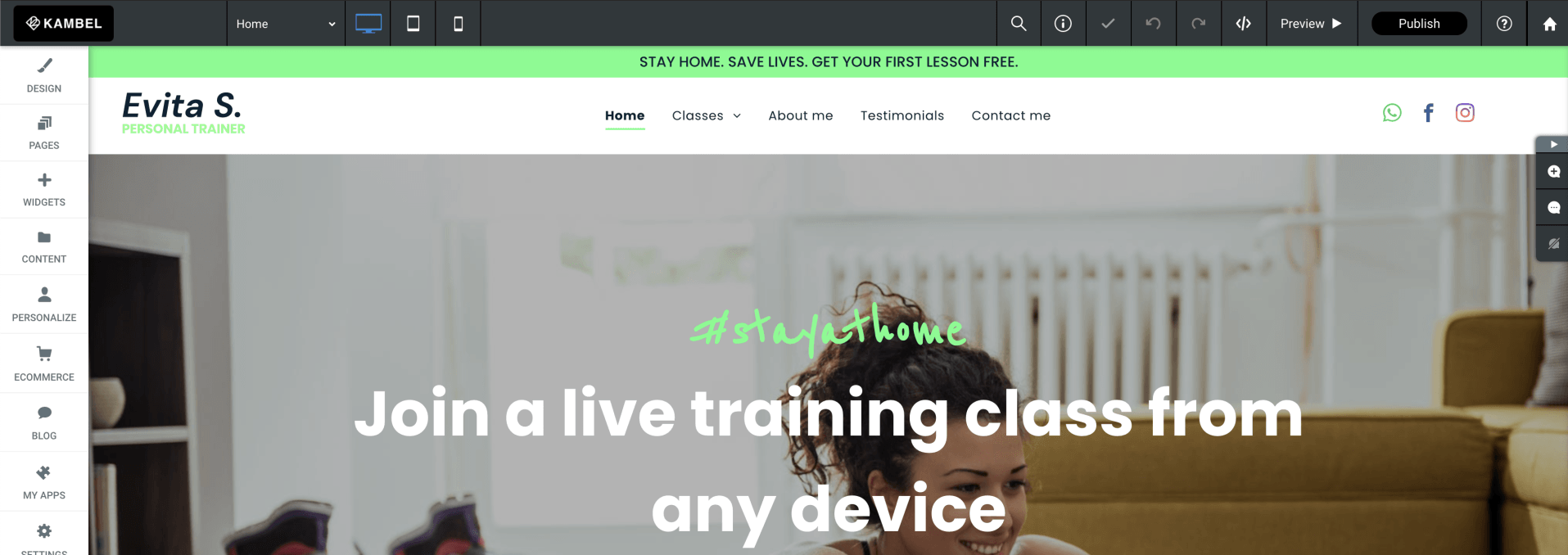
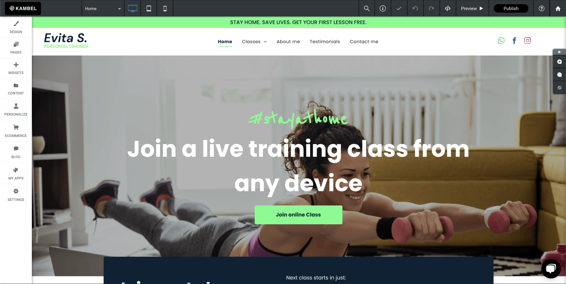
The first thing that we need with every website is our header area, this is always at the top of your home page and has all your navigation links so that a user can easily navigate between your pages. And always has the ability to get to other pages easily as well as your primary call to action so that a viewer is always drawn to take action, our header wants to consist of, our primary logo (connected to return a client to the home page), navigation links (all your main menu options), social links and your call to action. So for today, we will use contact us as our primary call to action. Now my personal preference is this, I like to use what’s called a sticky header. This means our header is always at the top of the page when the viewer scrolls down or navigates to another page, but I also like to reduce the logo size when the viewer scrolls down so our header is not taking up too much space. This to me is important so that we allow as much space as possible to see our actual home page, but the viewer does not have to scroll all the way back to the top when they reach the bottom of each page, which is going to happen often.
What’s a hero image and why is it important?
Next up we need to add in a hero image. Now there are several ways that you can do this, however today we are going to add in what we call a cover image, and to give it some life we will add a parallax over the top of it to give it a free moving effect. Now, remember your hero image is just that don’t scrimp here as you only get one chance to make a first impression and that is exactly what you are doing when someone lands on your website you need to wow them so they want to scroll down the page, so for today I will choose a lady doing some aerobic exercises and insert that in, it is also important to consider the quality of your image, angle and what’s in the image.
Add your opening text
Next up, we need to add our opening text again this is crucial text as this not only tells your viewers what you do but it also tells Google what you do. This text should be classed as H1 text (we will talk more about his in our next blog), however for today let’s drag in a text box, add our text and then select the setting Heading 1.
Then we need to add some subtext, again this plays two crucial roles, as the H1 tells google what you do, and the subtext H2 tells google and your viewers who what and where you are.
Then we could also add in some short body text however this is not essential, something to remember on a website less is often more, try not to overcrowd your pages with too much text, let's be honest no one wants to read it any way they want the essential information and I will let you in on a massive secret, no one wants to know that much about you, they want to know what you are going to do for them, or what your product or service is going to do for them, how it's going to solve their problems, so don’t make the mistake of rambling on and on about yourself, no one cares!!
Tell people what you do!!
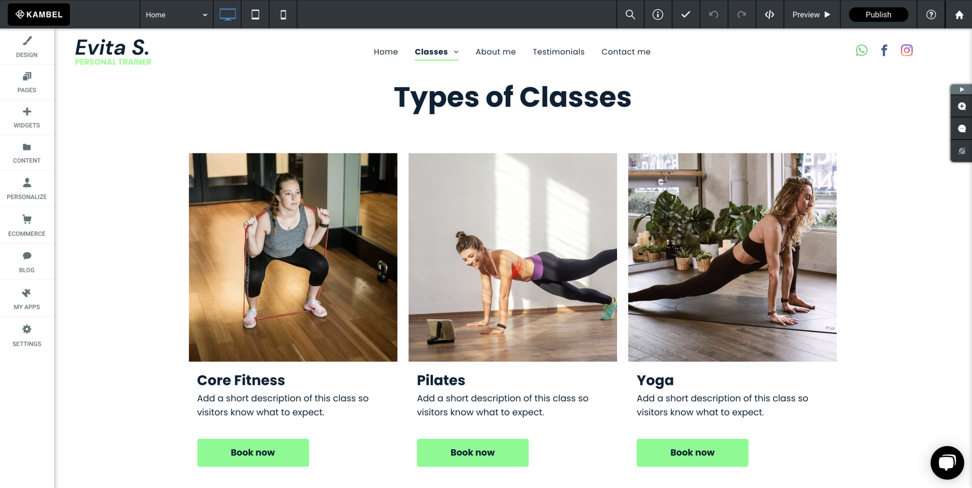
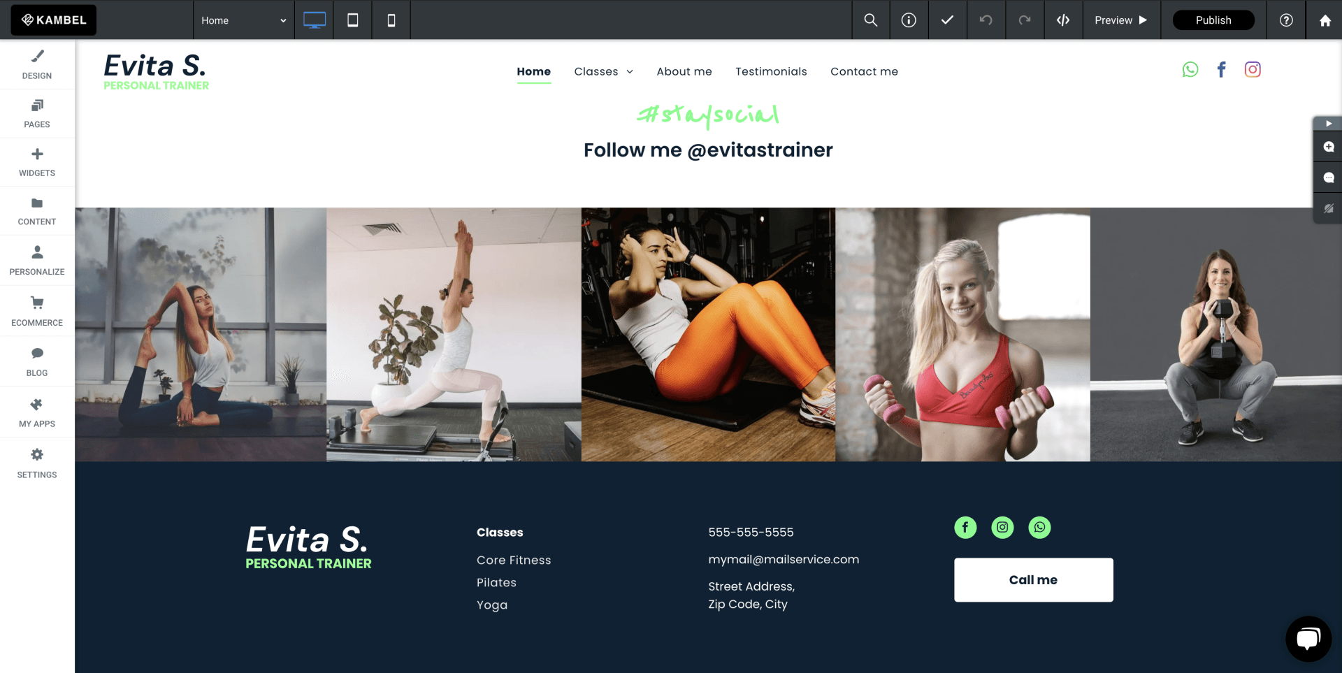
Next up you need to do one of two things you either need to add in some salient points about what your business or service is going to do to benefit the viewer and this what we are going to do today. We're going to showcase your services on offer so that the viewer isn’t having to search around for how you are going to solve their problems or how they can book you. So the easiest way to achieve this, is to showcase your services with a visual image, some text and a call to action button. To do this, we will add in a photo gallery widget, add in the images, then style up and add out heading text for each service and create a call to action button. Now this can either go directly to your booking software (if you are using some), contact form or onto a learn more page where you can display more information. The main aim here is to showcase your services, again don’t cheap out on images, get yourself some good images. There are plenty of stock images you can buy or spend some money and have a photo shoot done, remember this is your business, you still need to spend a little money to showcase what you do.
So, let's drag in a photo gallery widget, then select out images, add out heading test and button text and style it so it matches the look and feel of our page.
Let's Tell Your Viewers Something About You
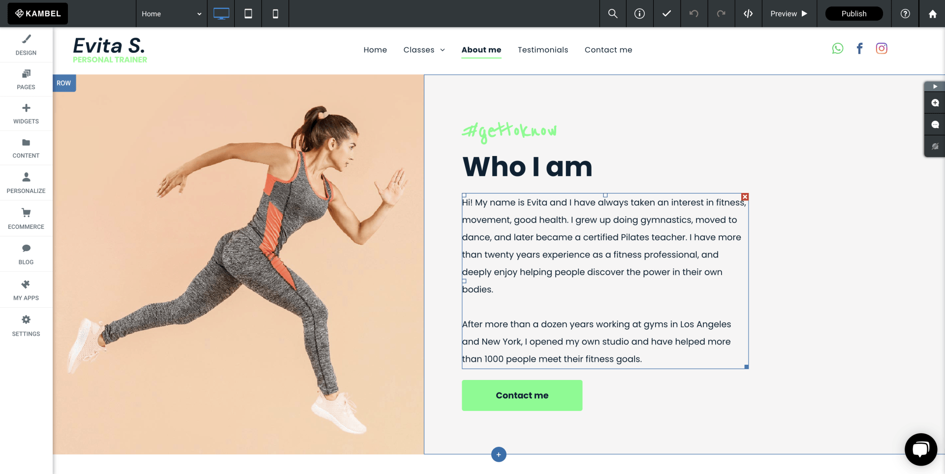
Then the next thing we ideally want to do is tell our prospective clients who we are, so next you want to add in a new row and break it into two columns, on the left side we will insert an image out yourself (ideally), again remember showcase yourself don’t just take a selfie while you’re standing in your kitchen.
On the right-hand side, we will add some H2 text to describe to the viewer that this is information about you, but this also tells google it’s about you as well, and then under our H2 let's add some body text that has a very short description of who you are. Here think of your best features that will help a client decide if they want to do business with you, then add in a learn more button (if you are building another page about yourself) if not don’t add in a button. Here it is also worth thinking about altering the background colour of the text side this will help break up the sections of your home page.
Why should I add social proof to my home page?
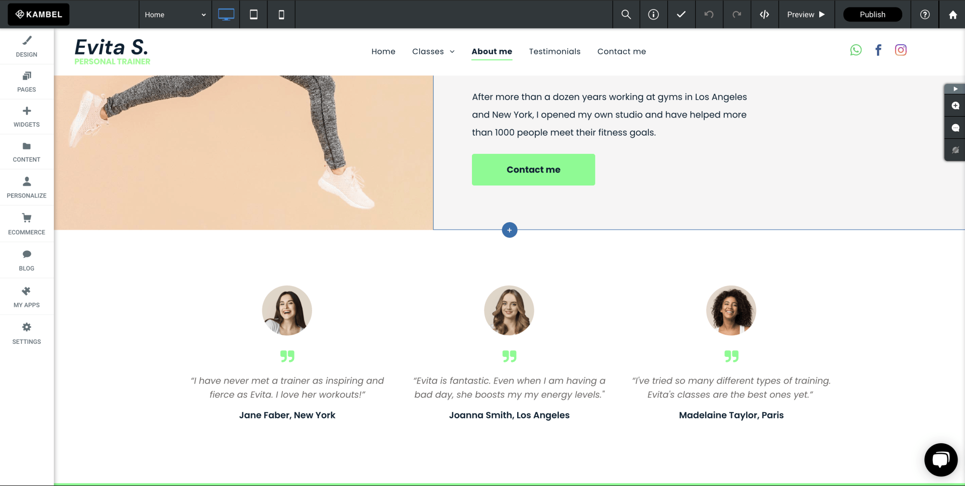
Next up is social proof, remember people by from people so you want to get some testimonials on your home page. So let’s start with a new section on the Avanty builder - if you select the add section you can then chose a pre-styled testimonials section and then style it accordingly so that it matches your look and feel of the home page, keep its simple, Image, text, name, no fuss and not too much text again. Get the important bits, you can always add a learn more button. If you want to allow clients to find about a clients testimonial or maybe a full case study, and this becomes a good use of space, and additional pages to your website, as remember the more pages you have the more chance you have of being found on Google.
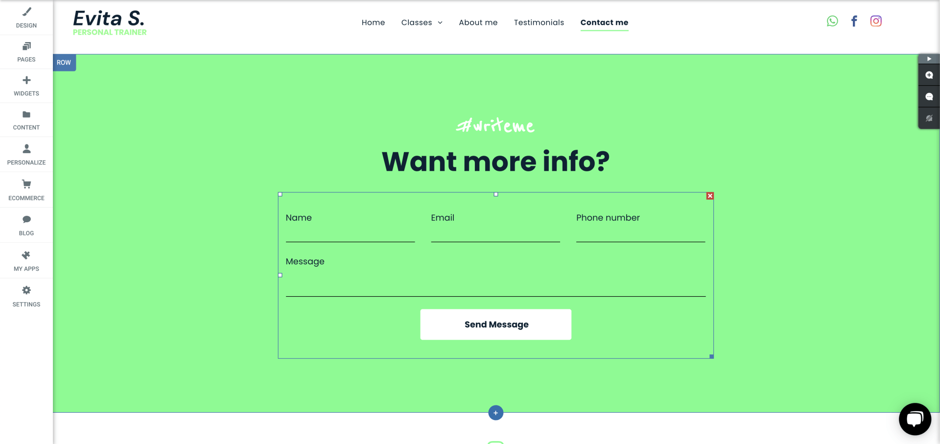
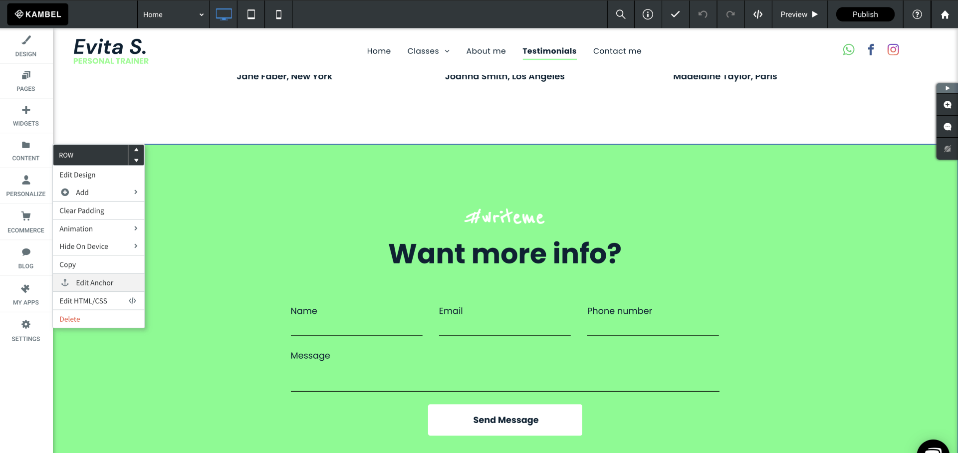
Now we mentioned earlier that we needed to have a think about how our customers are going to interact with your website. For today, we are going to add in a simple contact form, however, you can add in a calendar, diary or much more but let’s keep it simple. So again, we are going to drag in a simple contact form, and add into our form, name, e-mail, phone number, and a message box. Now something to remember is that all contact forms are stored in the website when a client fills one in, however it is a good idea to think about your CRM at this stage as while you may be small now as you grow you want something more robust system to manage your clients. Again vCita can manage this easily for you, or you can pull in third party software like MailChimp, active campaign, HubSpot and many others.
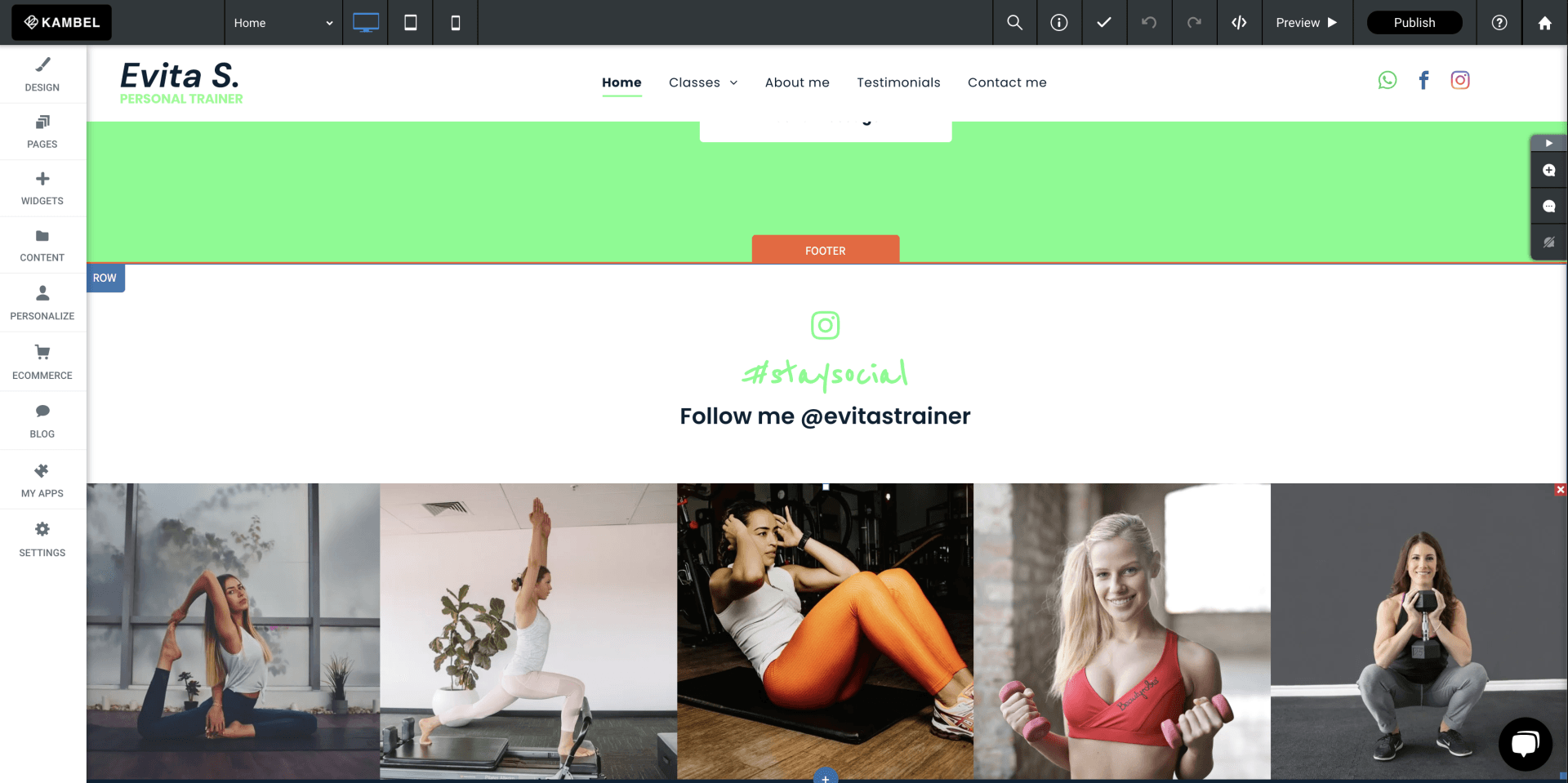
To make sure our home page is always fresh, we are adding yet more social proof. For example, lets add in our Instagram feed, this way as you add posts to your Instagram, they will update on your home page. Vwala, your page is always fresh. To do this, let's add in another photo gallery widget, but this time we are going to connect it to our Instagram account. This is very simple as we have pre-configured our photo galleries so you only need to log into your Instagram account and accept the terms and now lastly lets style it up so it looks good, and in keeping with our page.
Then we need to cap our website/home page with a footer. Now people don’t give enough attention to their footers but your footer should be the place a viewer can go to find out all your information. So here, while we build our home page, we shall add a new footer section. Then we will add in our logo to the far left, in the next column our menu structure (we will come back to this part). Then add in the next column our contact details, and then finally in the far right out social media details, and contact us button.
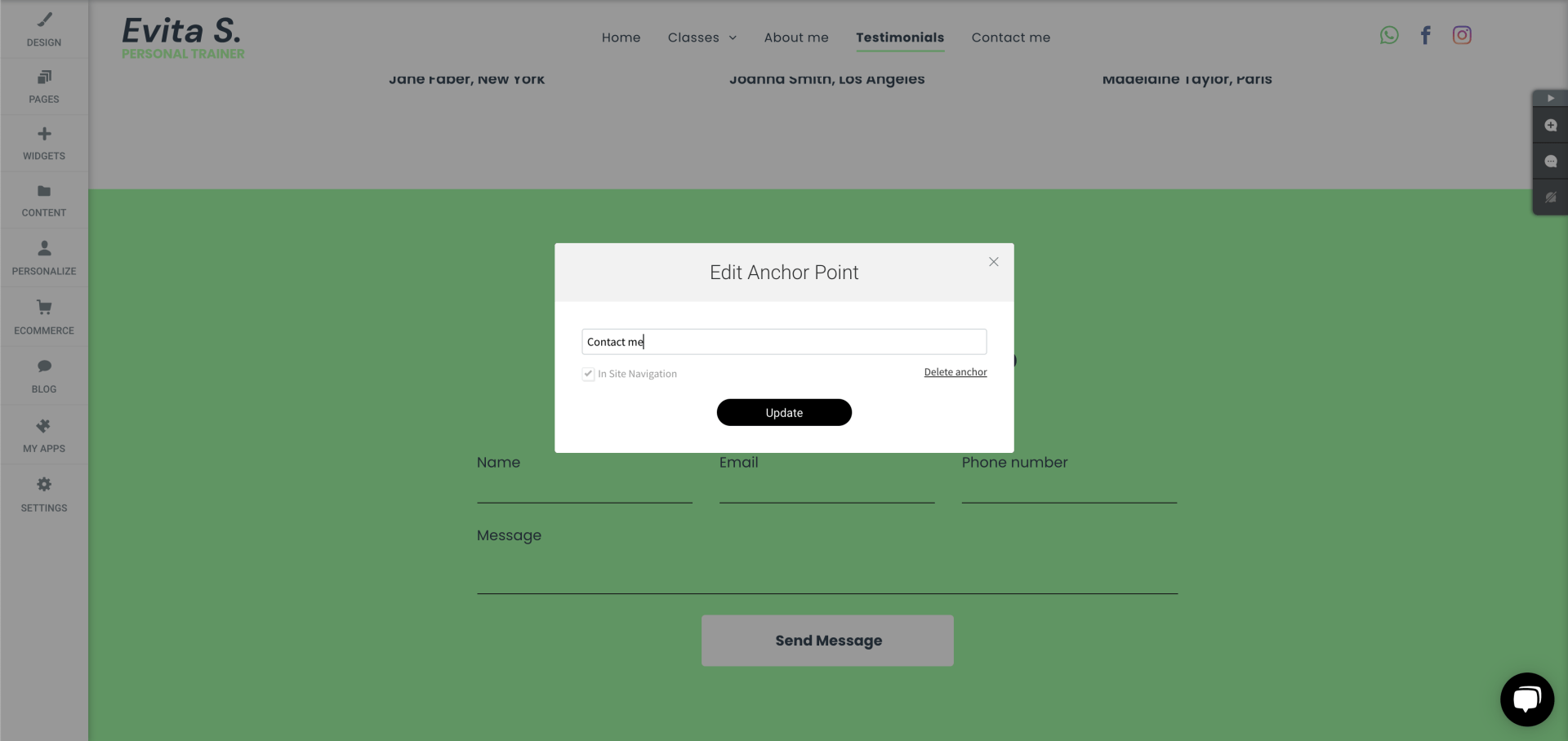
Now we are not quite done even though we have made it to the bottom. We haven’t actually created a menu structure at the top or the bottom, because we only have a home page. To overcome this, we will add what we call anchor points to each section of our home page. So working our way back up the page on each section, you will see a small row tab, select this and then select, add anchor, and add an anchor to each in here. So let's do this for our contact section, about section, and services. Now we have 4 menu options which is a good start until you add in more pages to your site. And we can now add these to our header and footer sections so that you are adding a menu structure to the top and bottom of your website.
And that’s it, you have officially built your first home page. Feel free to give it a go on our website builder as we offer a completely free trial. You can practice to your heart's content, and if you get stuck, we are always on hand to jump in and help you with anything you are unsure of.
