How often do you consider the way in which the text can visually reflect the tone and emotion of what you're saying? We've all sat there, whether it be a written essay, text or going old school and written a letter, to carefully consider the words used so they reflect the emotion in what we're saying, right? But what if I told you the font is as important as the words when it comes to reflecting intended tone and emotion?
In a recent one to one session with a Avanty customer, typography was the key topic of the session as the web builder didn't know the do's and don'ts when it comes to picking fonts for a website.
So in this blog, we’ll examine the power of typography. You’ll find the definition of typography, a brief on all the key elements of typography, and tips on how to choose the right fonts for your website.
What is typography?
Typography is the technique of arranging letters, numbers and characters known as type. It also refers to different elements of typography including the size of the letters, line length and the spacing on a line or the entire page. Beyond that, it can be used to exude a certain mood or strengthen a message. To do so, we use different typefaces and font styles, as well as adjust the size, spacing between letters and words, and much more. But why is typography important for websites? Well, the aim of typography is to create text that is easy to read and interesting to look at to increase exposure and sales of your product(s)/ service(s).
Are fonts and typefaces the same thing?
No, there are distinctive difference between fonts and typefaces, and this is the time to clear the confusion.
A typeface is the collective name of a family of fonts (for example Arial,Helvetica, Times New Roman, Open Sans, Poppins etc), whereas a font refers to a specific style within that typeface - such as semibold, bold, italic, light etc.
Typography tips for your website
Writing content for your website is one thing, but deciding how best to present it is quite another. The following tips are specifically aimed to for those building websites for themselves or their businesses who are unsure on what typography to use or are unsure the one they are currently using is working for their intention. For inspiration on how to successfully implement typography techniques into your website, take a look at our 6 top tips to take into account when creating bespoke websites.
1) Reflect your brand identity
When building a website, it's important to reflect your brand and what you're all about. Through images and text, your visitors should be able to know what you do and how you do it. So using the right typography is so important to get your brand identity across.
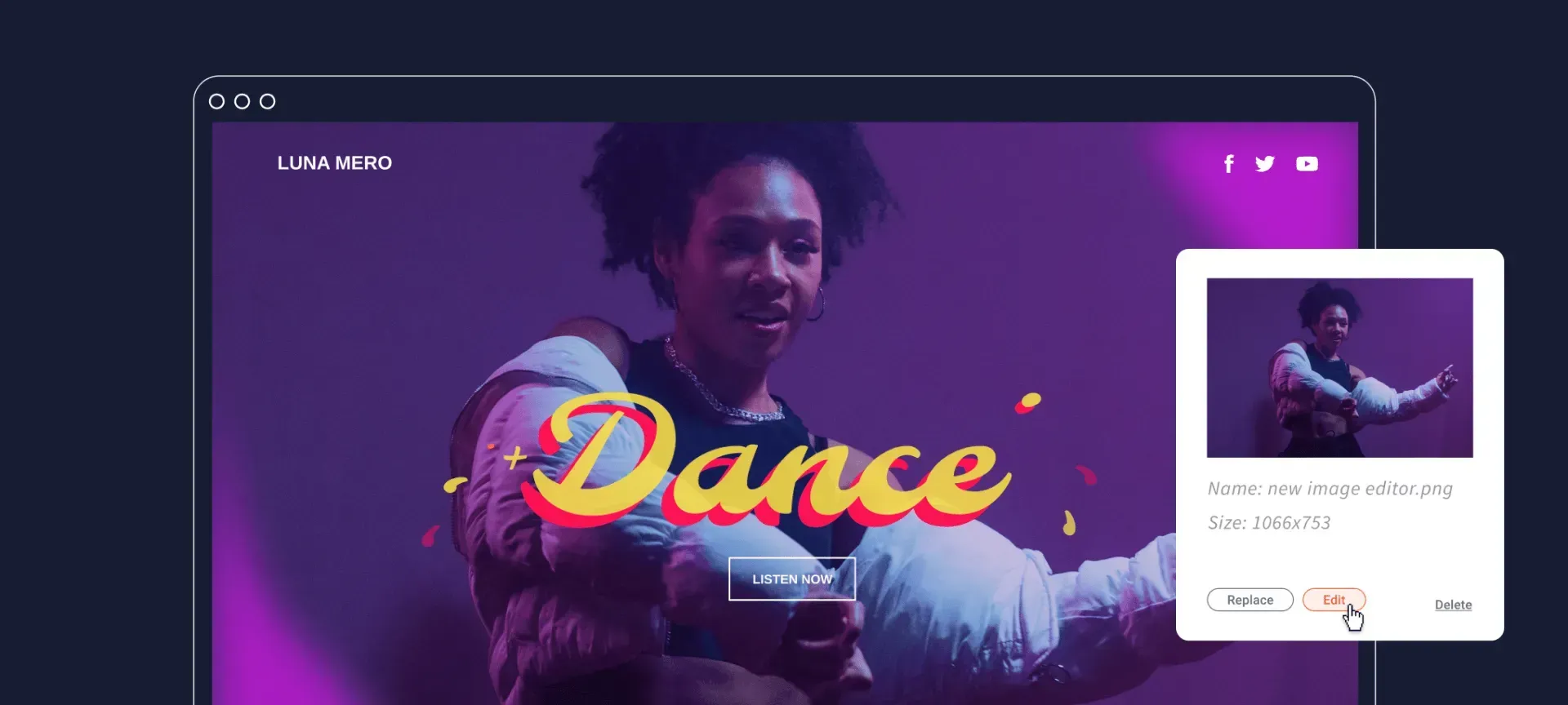
Are you fun and energetic? Or are you calm and relaxing? Whatever it is, search for a typeface that expresses your unique identity. In order to choose the best font for your website, start off by collecting a few that feel right to you, then narrow it down once you have a better understanding of what you’re looking for. Process of elimination is always a winning strategy here.
2) Be consistent throughout your website
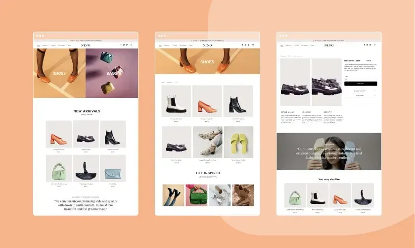
Consistency is key, always. Everything from your brand colours to your typography choices, you need to be consistent throughout your website.
Create a holistic experience by using the same fonts and typefaces throughout your website. While you can merge up to three typefaces in the same website, we advise you don't do anymore than that as it soon makes your website too busy, overwhelming and generally just not good to look at (more on this in point 3). So use the same typefaces in the same contexts. For example, if the title on one page is written in Helvetica Bold in 36px, make sure all the other titles across the website are the same. To make your life a little easier, you can customise and save text themes to use them repeatedly throughout your website.
To do this in the Avanty web builder, simply go to your website > Design > Global Text. In Global Text, you can change all the H1, H2, H3, H4, H5 and H6 to any font, size, colour etc and get it to change through your website so they are all consistent throughout.
3) Stick to two or three fonts
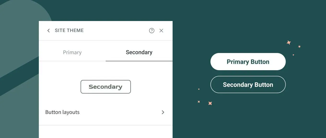
In the case of typography, less is more. Setting limitations can be an invaluable when it comes to creativity. A website made up of multiple typefaces can appear messy, busy and overwhelming. Instead, opt for no more than three typefaces and use them consistently throughout each page. Pick one typeface that will be used mainly for titles and headers, and one for the longer blocks of text, like descriptions and blog posts. If you want to add some variety, use a third typeface for calls-to-action.
4) Make it easily readable
Sounds obvious, right? All of the text on your website must be clear and readable for all visitors. Check that your text is large enough to read on all devices (desktop, tablet and mobile). The typeface you choose should also work well in the font size you’ve chosen. Some typefaces may look great as headers, but are less legible in smaller sizes. But this is the fun part of choosing the right typography for your website, you get to test and measure what works for you and your visitors.
5) Explore font pairings
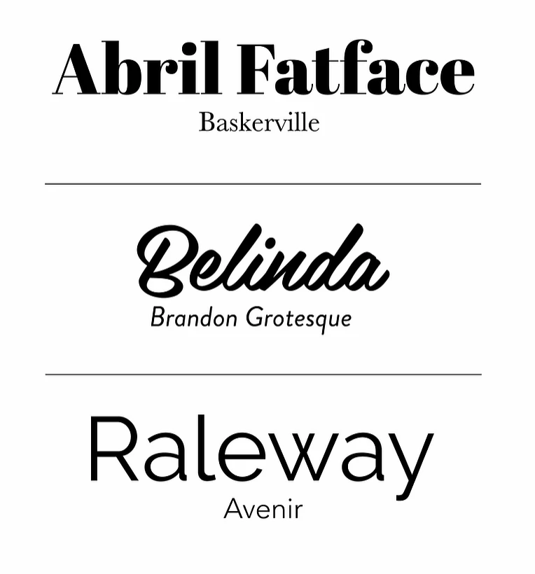
When finding the best font pairings for your website, keep your brand identity as a main focus. Make a note of which font will be used for titles and which for the text. The latter should be clean and easy to read, whereas you can get a little more expressive with the headers, choosing a typeface that really speaks your brand. The headers are a chance to be bold and loud if you so wish.
6) Pick fonts that are web safe
In order to make sure your website appears the same on all devices, use fonts that are web browser friendly. As each device has its own built-in set of fonts, if your website includes a font that is not web safe, the text could show up in a different font than the original. Not exactly the look you’re going for, it makes the website look messy. However, this can easily be avoided this when creating a website on Avanty, by using any of the professional pre-installed fonts. Additionally, you can download web safe fonts from one of the online resources such as Google Font and upload your own font to the Avanty Editor.


