A new template has landed, and it’s a great choice for insurance agencies, service providers, and various professionals.
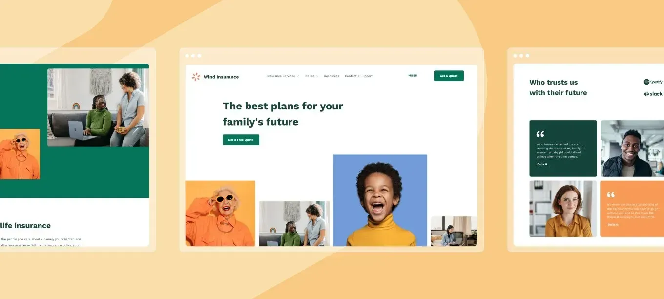
This easy-to-use professional template offers ample spaces for content and service descriptions. Tailor this template to your client’s needs by adjusting the texts and design to build a polished and appealing website presenting their business.
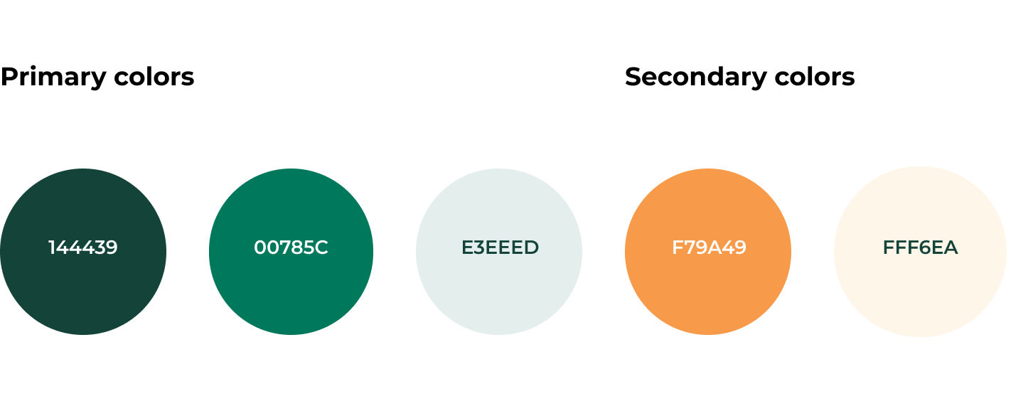
By using the following carefully chosen set of colors, this template creates a sense of confidence, and it increases trust among site visitors:
This template has everything you need to have a professional website set up fast:
- A homepage - the first point of entry. This is where the important information should be.
- All insurance products - a page listing all available products and services.
- Life insurance page - a dedicated page for showing in-depth info about a specific product or service.
- A claims page - a page offering general overview of insurance claims.
- A claim info - a page detailing the process of how to file an insurance claim.
- Resources (blog) page - a blog page where site visitors can get additional info and resources.
- Contact page - a page where site visitors can get in touch.
Additional template components perfect for insurance
Breadcrumbs navigation widget
This template comes with a breadcrumbs navigation widget - the small text path you’ll usually find on the top of site pages that indicates where you are within a website (for example, Home > Men’s > Shoes). Breadcrumbs are great for SEO and user experience.
FAQ & claims process
The accordion widget is used in several places in the template. FAQs are a great tool for answering site visitors' potential questions in advance in an easy to use, visually pleasing way. This puts prospect customers at ease.
Blog
Blogs are a wonderful addition for any site. But in this case, the blog serves 2 important goals:
- It offers site visitors additional info and industry related content. This lets site visitors feel there’s a serious and professional business operating this website.
- Search engines love websites that show content updates on a regular basis. So regularly maintaining a blog with original and relevant content can help your site rank higher on relevant search results.
Here’s how to reproduce the homepage design
- Add a row below the header. Set the top padding to 50px, the bottom to 40px, the left to 100px and the right to 40px.
- Add a text widget. Set the style to Heading 1. Set the color to #144439 and the text size to 60px.
- Add a button below the text and add your textual content. Align the button to the left. Set the button color to #007559.
- Add another row below. Set it to full bleed and reset all paddings to 0px.
- Add 3 columns to the row, to make it a total of 4 columns.
Modify the columns:
What to add to column 1
- Add a background image and set the position to full and middle bottom.
- Add a spacer widget.
What to add to column 2
- Set the left margin to 20px.
- Add a background image and set the position to full and middle bottom.
- Add a spacer widget.
What to add to column 3
- Adjust it so the column is wider than the one on the right.
- Set the left margin to 20px.
- Add a background image and set the position to cover and center.
- Add a spacer widget and set its height to 560px.
What to add to column 4
- Set the left margin to 20px.
- Add a background image and set the position to full and middle bottom.
- Add a spacer widget.
Now adjust the design for mobile screens
Change the editor’s view to mobile view and adjust the design:
Top row
- Set the top and bottom padding to 50px.
- Set text size to 35px.
Bottom row
- Set the top and bottom padding to 0px.
- Change the row layout to 2 columns.
Top left column
- Set the spacer widget’s height to 170px.
Bottom left column
- Set the spacer widget height to 170px.
- Set the background image position to cover and center.
Get started with the insurance template today, and build a professional website for your clients.
